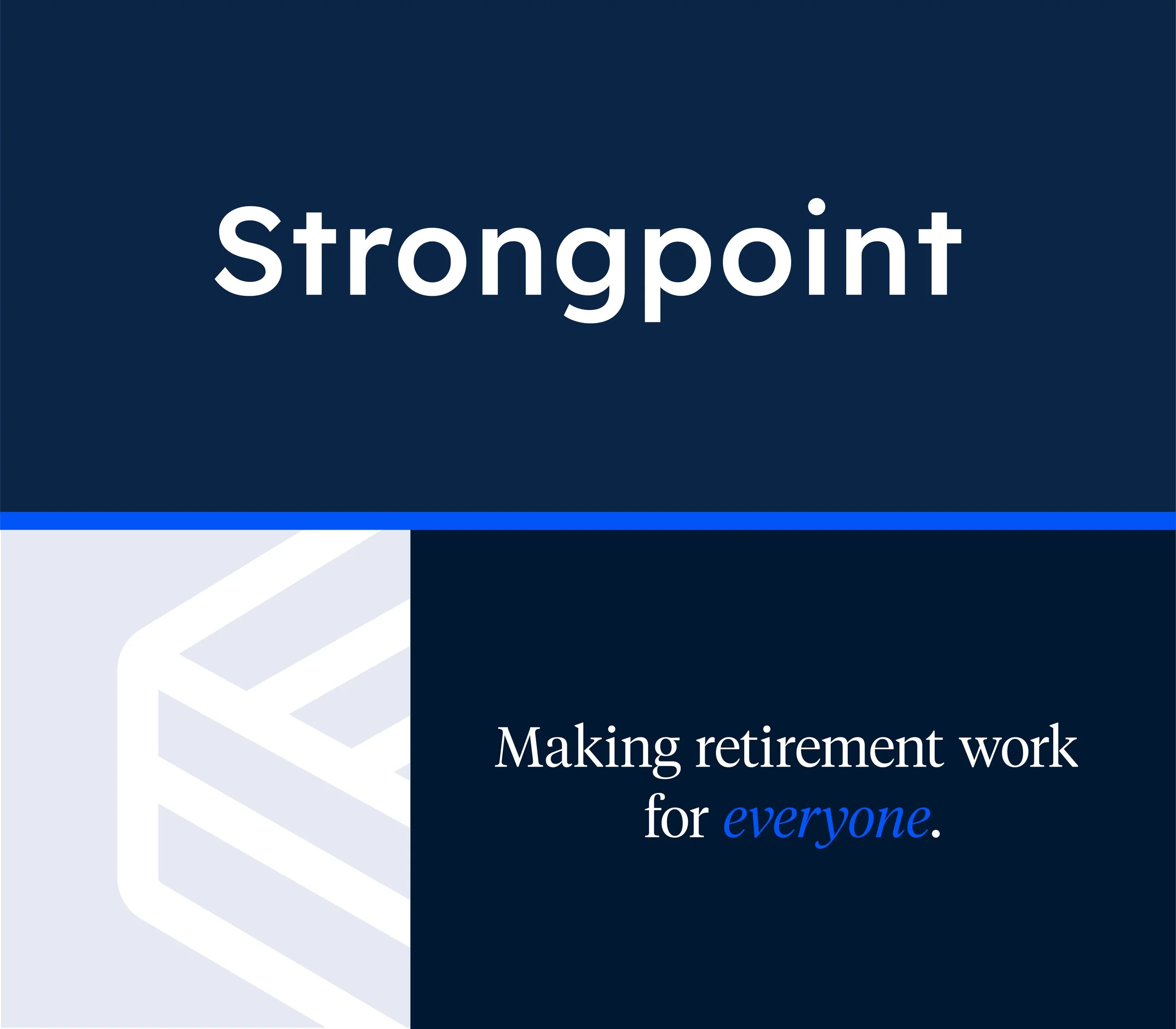
Strongpoint
A fast-growing, tech-enabled financial services platform providing third-party retirement administration, recordkeeping, and integrated payroll + HR tech for small and mid-sized businesses.

The original branding posed a few pain points:
Quite heavy and difficult to use in context
Lacking in a responsive approach
Not totally apparent the mark is an ‘SP’
The brand palette wasn’t digital-friendly — it was dull and dated.
The brand font felt juvenile in certain letterforms, lacked in versatility, and didn’t capture the traditional nature of client base.
Several touch-points lacked in design consideration. The absence of grid structure, volume of copy, and indistinguishable hierarchy resulted in poor readability and unpleasant user experiences.
Former Strongpoint Website
Former Strongpoint Presentation
Opportunities:Simplify the brand visually — then expand for functionality
Expand the brand into the modern traditional space to better resonate with highly sophisticated founders looking for strategic acquisition through type and color
Educate on the importance of and enforce white space
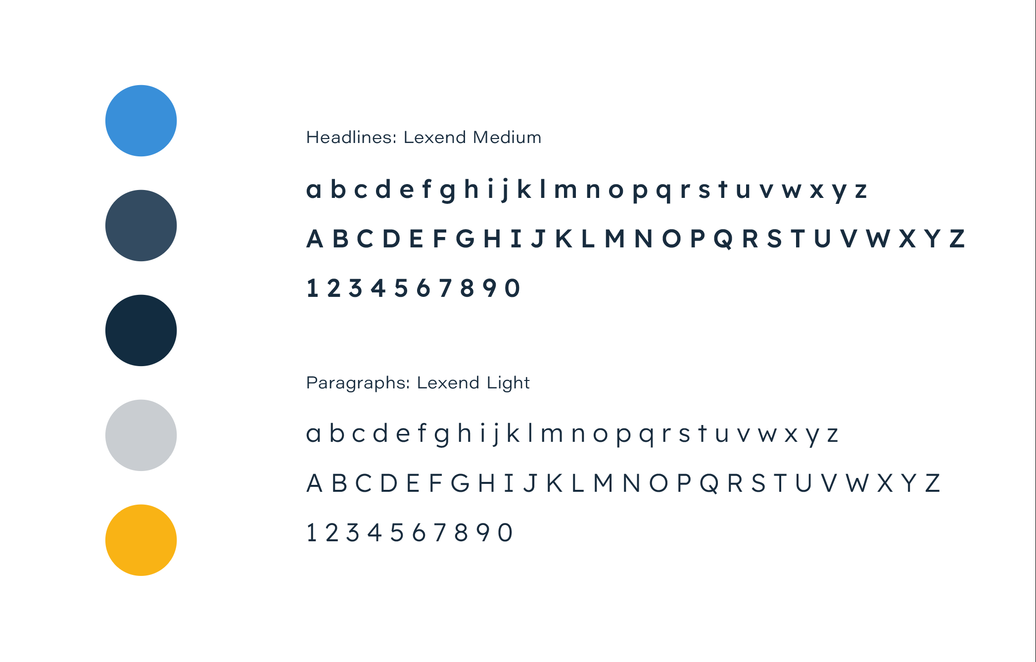
Brand Refresh at a glance


Print / Web / PresentationStrongpoint Out in the Wild
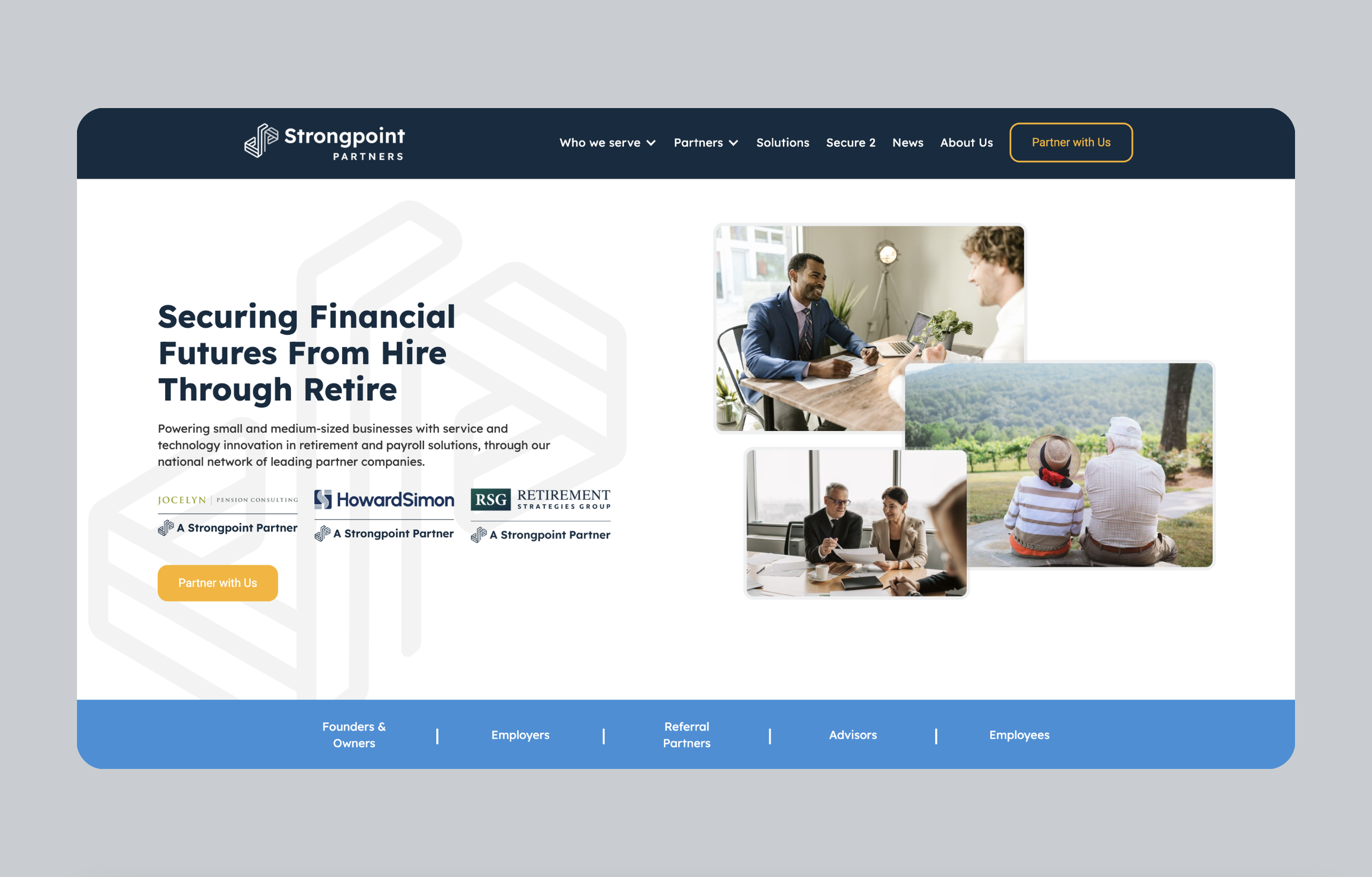
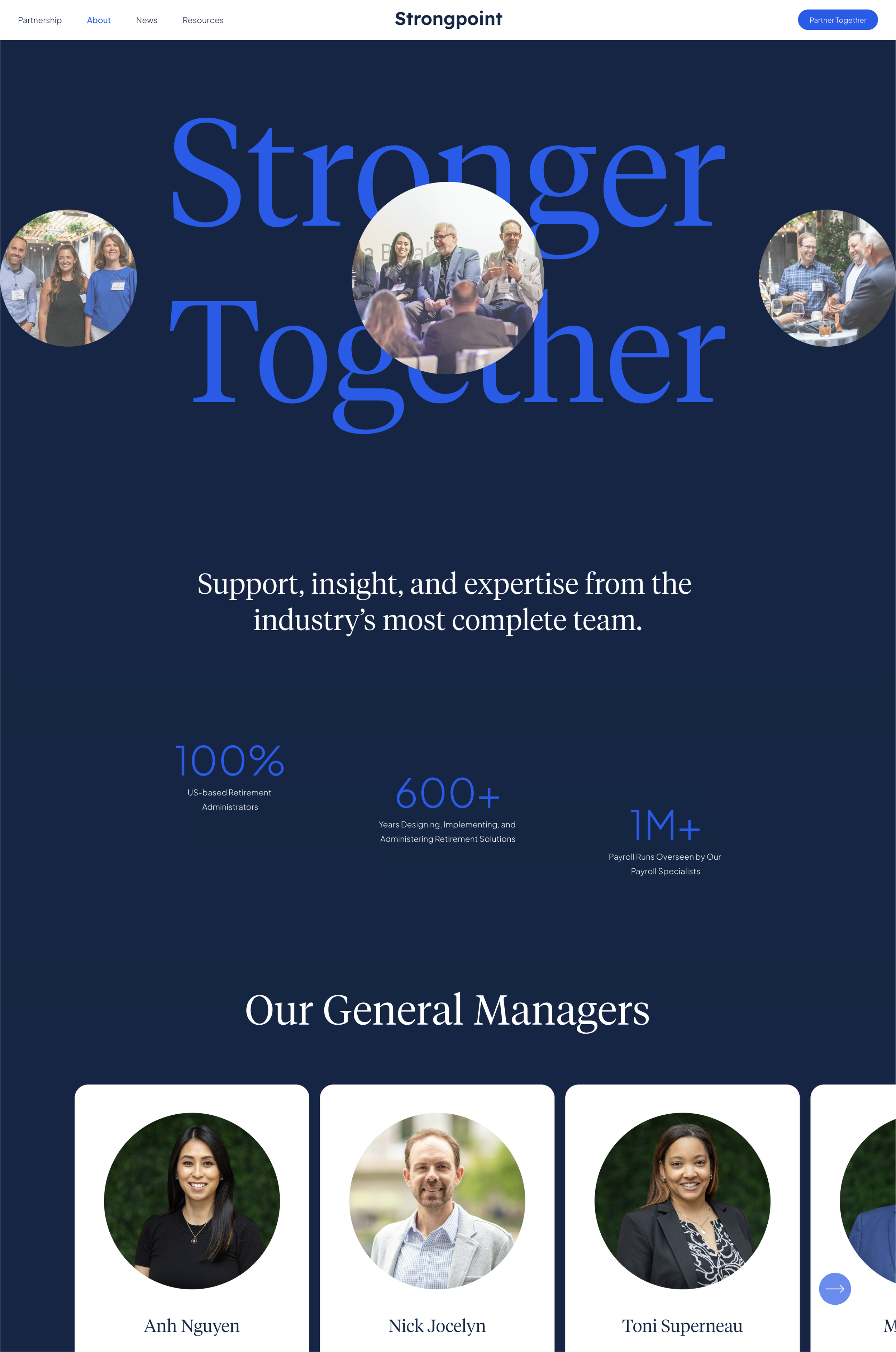
Website Design + DevCheck out the live site at strongpointpartners.com
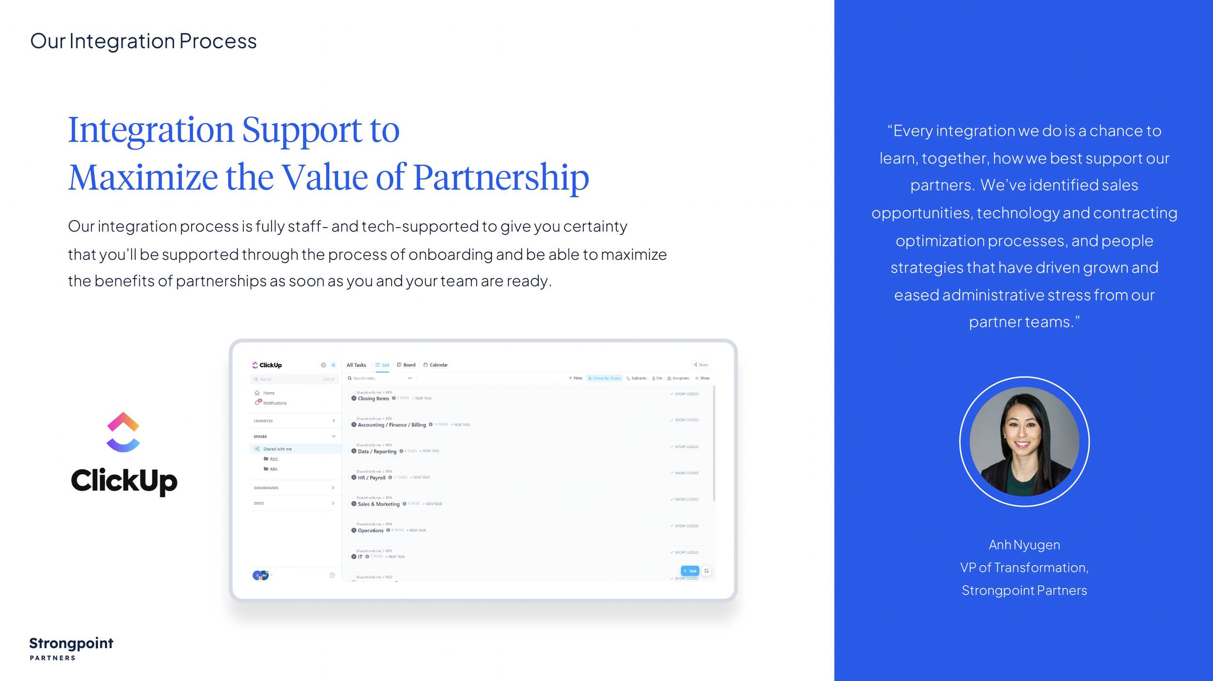
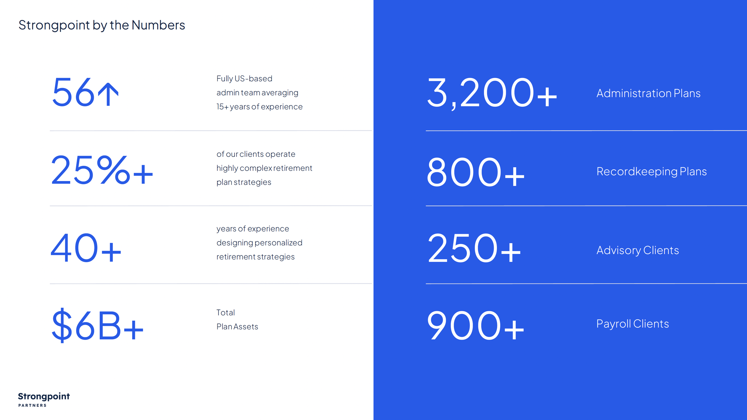
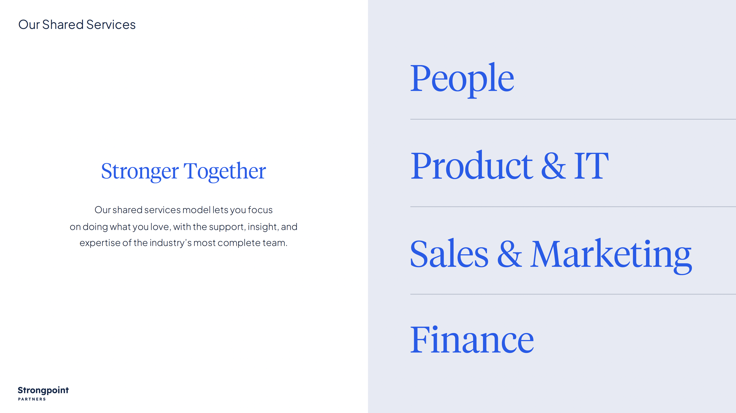
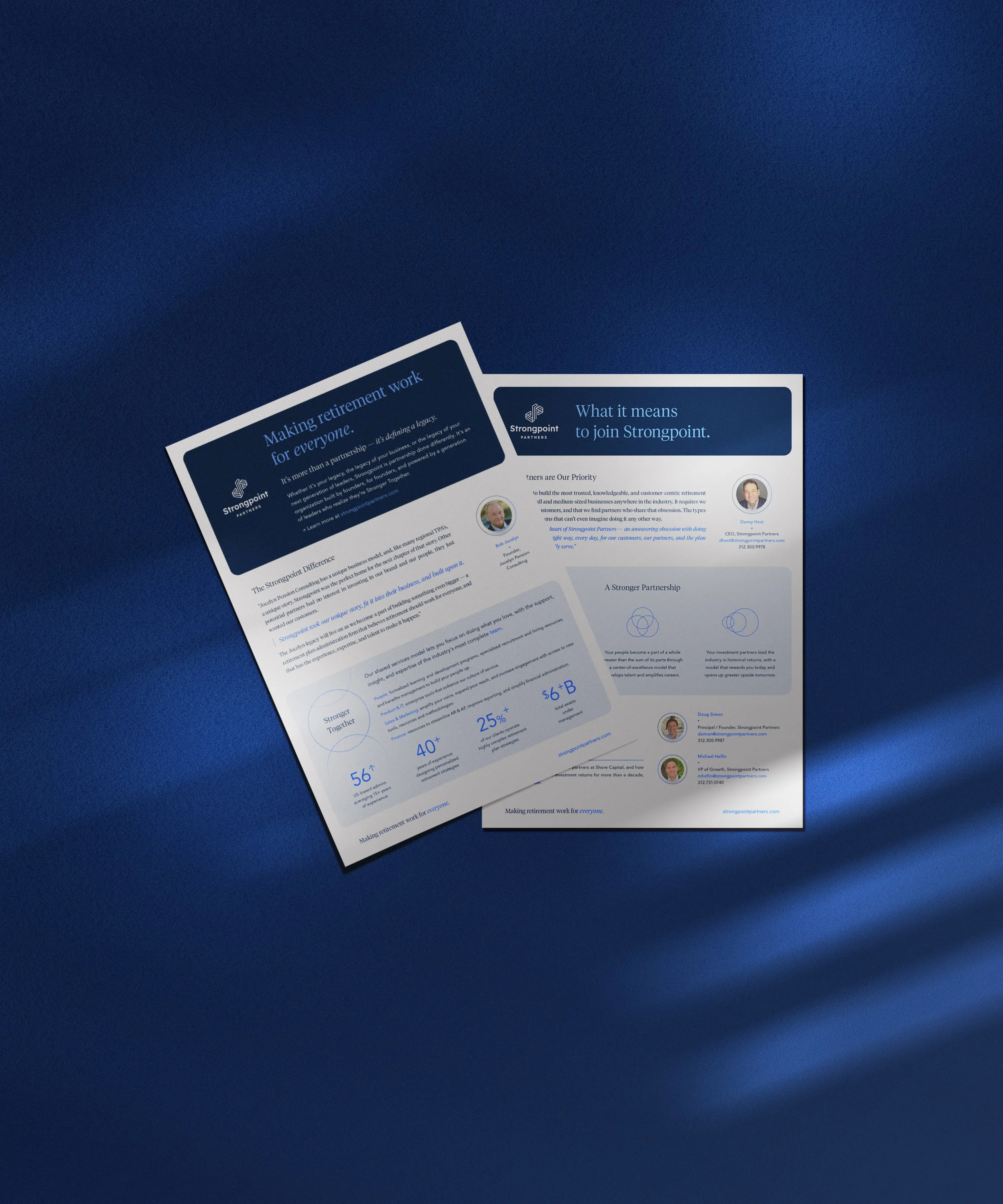
Print SampleMerger & Acquisition Deliverable (Confidential)
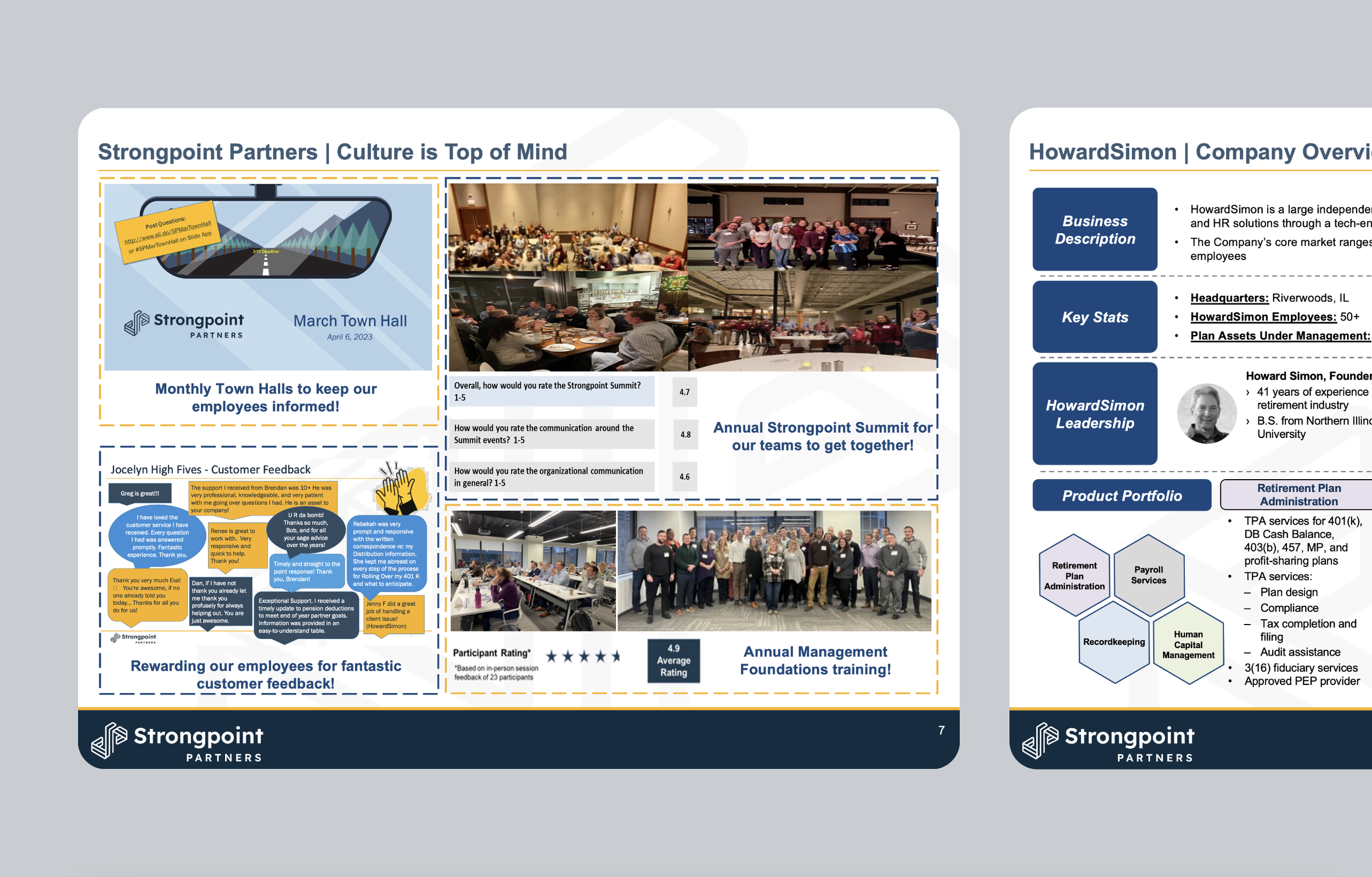
Presentation Deck Slide SamplesMerger & Acquisition Deliverable (Confidential)